ITS — Under a new flag into the future
Project Information
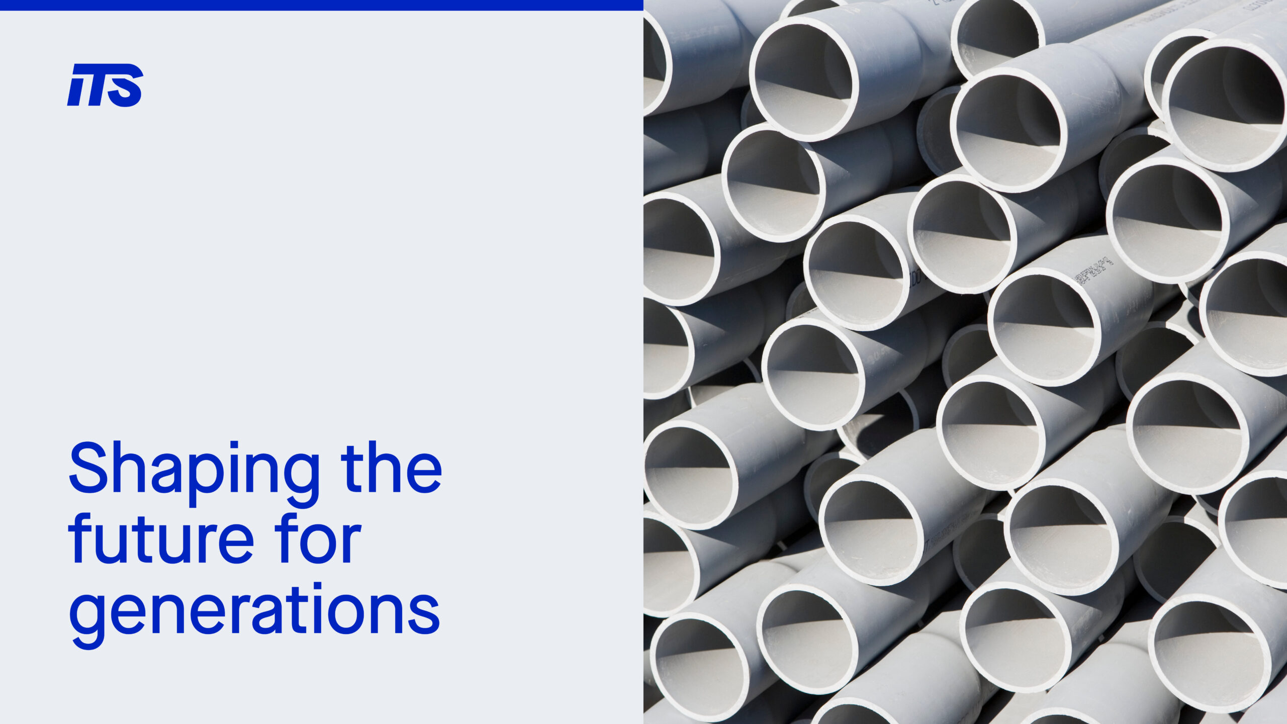
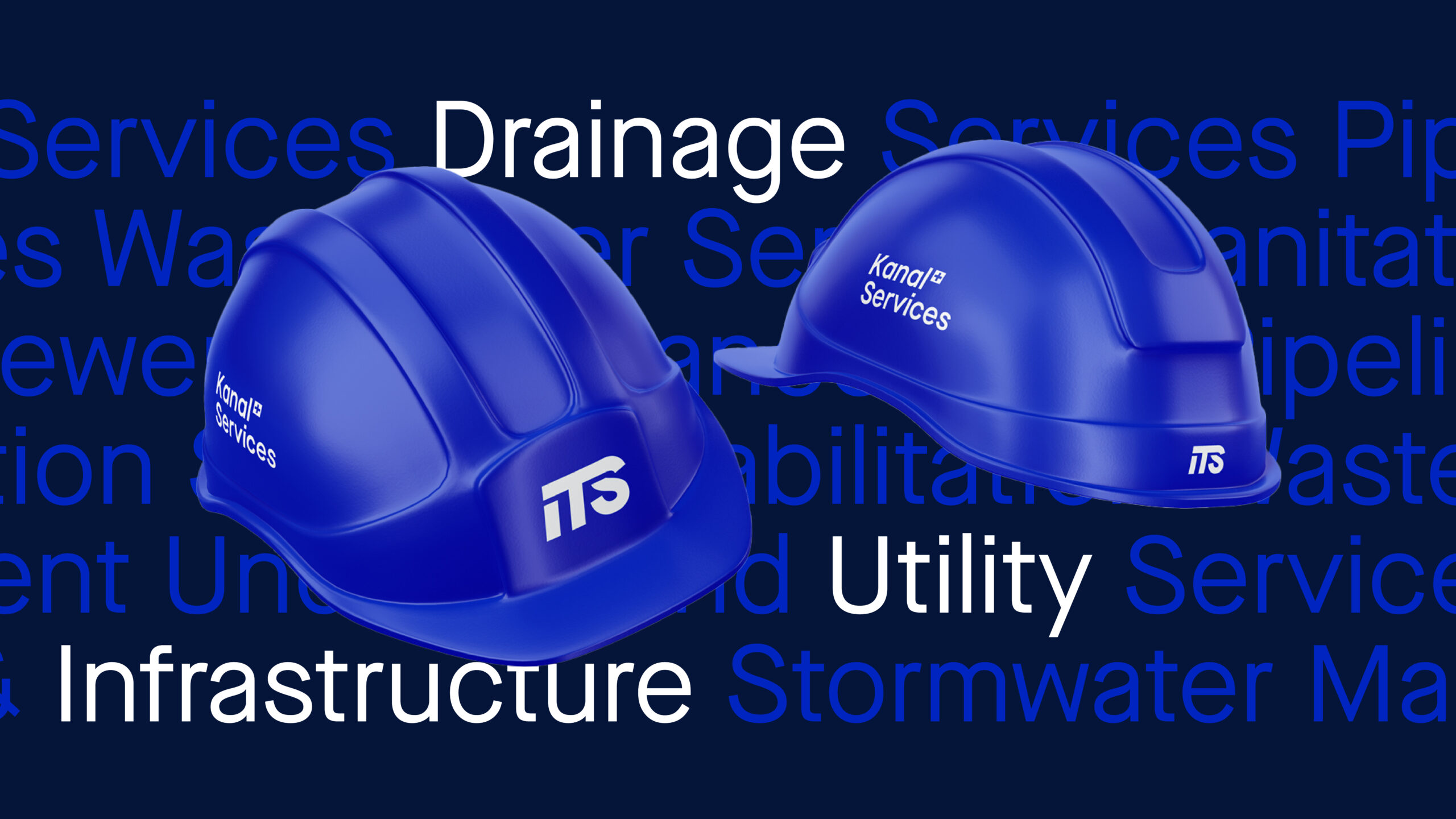
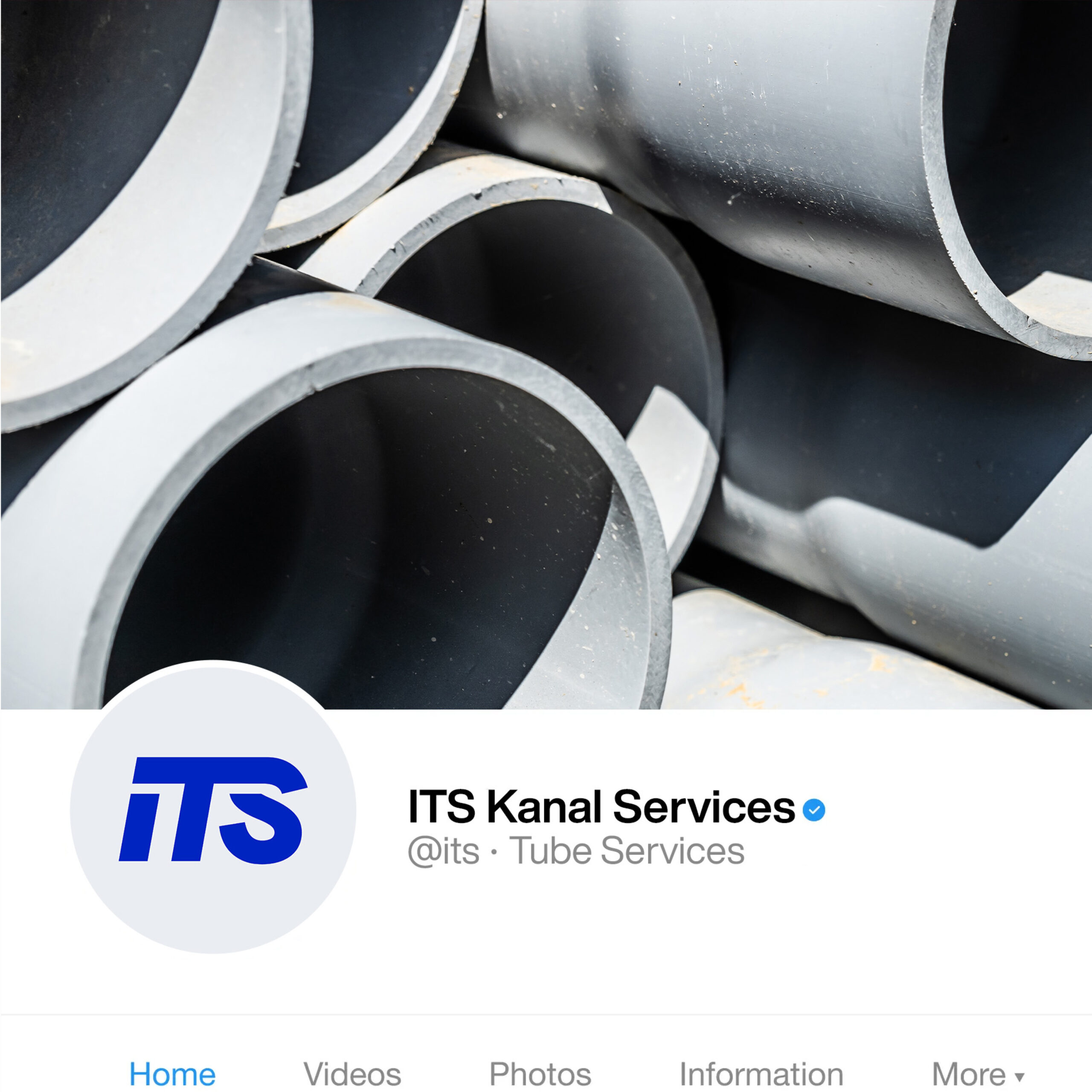
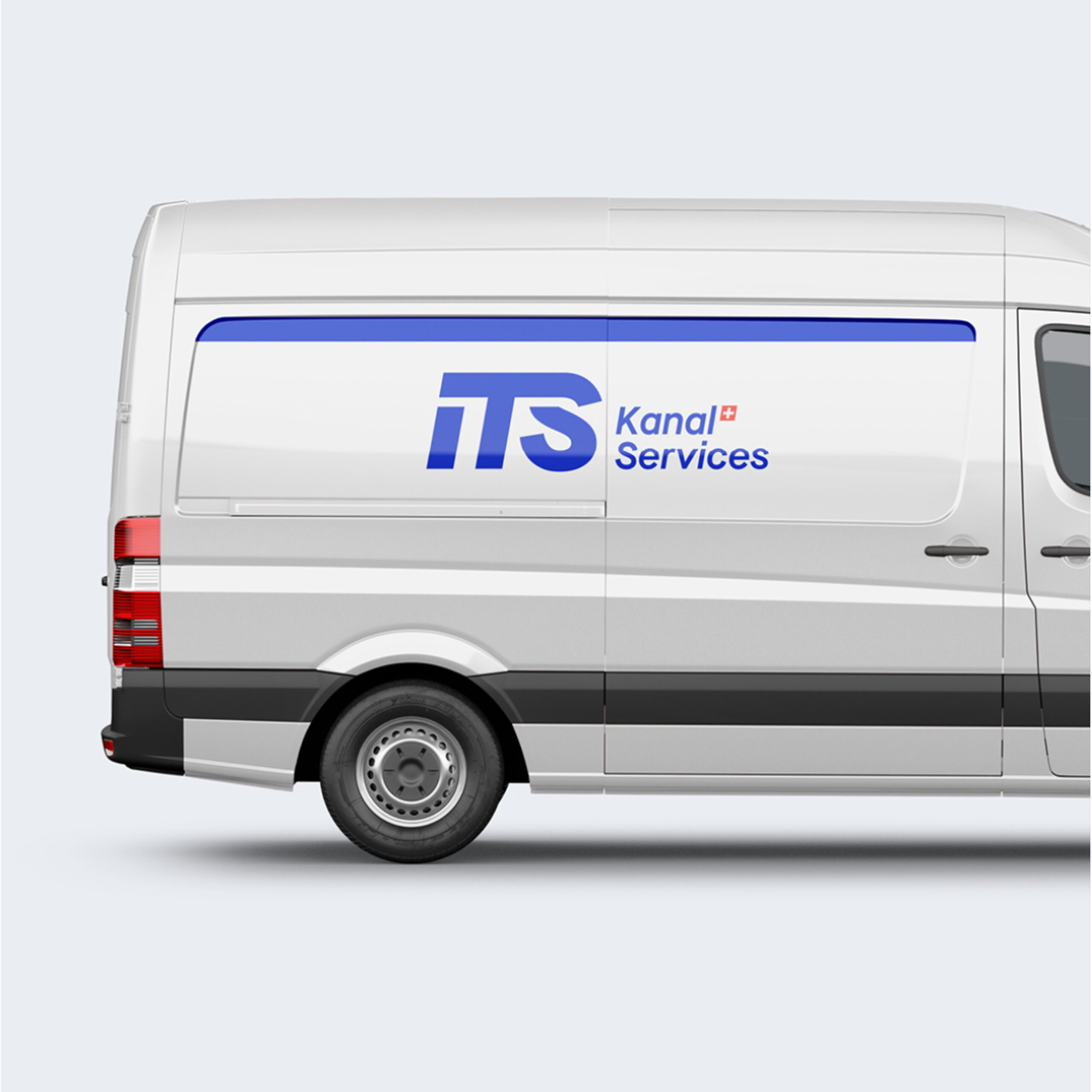
ITS stands for International Tube Services, which signals its extensive expertise in the maintenance and renovation of sewer and pipeline networks. The name is also intended to reflect the company’s vision for development, which includes expansion beyond Switzerland.
The newly developed logo reflects the solid quality of ITS's services and strengthens the brand’s impact in the market. The extended bar of the "T" gives the logo a distinctive character while symbolizing the ground beneath which much of ITS’s work takes place. The modern, fresh shade of blue represents trust and technology.
The new visual identity is being gradually implemented across the company. At Farner Branding, I developed the standards for the brand’s global rollout.


Approach
Transforming brands and businesses with simple, remarkable ideas.
Contact