German Design Award Special Mention 2022 → Red Dot Design Award Winner 2021 → German Design Award Special Mention 2022 → Red Dot Design Award Winner 2021 → German Design Award Special Mention 2022 → Red Dot Design Award Winner 2021 → German Design Award Special Mention 2022 → Red Dot Design Award Winner 2021 → German Design Award Special Mention 2022 → Red Dot Design Award Winner 2021 → German Design Award Special Mention 2022 → Red Dot Design Award Winner 2021 →German Design Award Special Mention 2022 → Red Dot Design Award Winner 2021 → German Design Award Special Mention 2022 → Red Dot Design Award Winner 2021 → German Design Award Special Mention 2022 → Red Dot Design Award Winner 2021 → German Design Award Special Mention 2022 → Red Dot Design Award Winner 2021 → German Design Award Special Mention 2022 → Red Dot Design Award Winner 2021 → German Design Award Special Mention 2022 → Red Dot Design Award Winner 2021 →German Design Award Special Mention 2022 → Red Dot Design Award Winner 2021 → German Design Award Special Mention 2022 → Red Dot Design Award Winner 2021 → German Design Award Special Mention 2022 → Red Dot Design Award Winner 2021 → German Design Award Special Mention 2022 → Red Dot Design Award Winner 2021 → German Design Award Special Mention 2022 → Red Dot Design Award Winner 2021 → German Design Award Special Mention 2022 → Red Dot Design Award Winner 2021 →German Design Award Special Mention 2022 → Red Dot Design Award Winner 2021 → German Design Award Special Mention 2022 → Red Dot Design Award Winner 2021 → German Design Award Special Mention 2022 → Red Dot Design Award Winner 2021 → German Design Award Special Mention 2022 → Red Dot Design Award Winner 2021 → German Design Award Special Mention 2022 → Red Dot Design Award Winner 2021 → German Design Award Special Mention 2022 → Red Dot Design Award Winner 2021 →German Design Award Special Mention 2022 → Red Dot Design Award Winner 2021 → German Design Award Special Mention 2022 → Red Dot Design Award Winner 2021 → German Design Award Special Mention 2022 → Red Dot Design Award Winner 2021 → German Design Award Special Mention 2022 → Red Dot Design Award Winner 2021 → German Design Award Special Mention 2022 → Red Dot Design Award Winner 2021 → German Design Award Special Mention 2022 → Red Dot Design Award Winner 2021 →German Design Award Special Mention 2022 → Red Dot Design Award Winner 2021 → German Design Award Special Mention 2022 → Red Dot Design Award Winner 2021 → German Design Award Special Mention 2022 → Red Dot Design Award Winner 2021 → German Design Award Special Mention 2022 → Red Dot Design Award Winner 2021 → German Design Award Special Mention 2022 → Red Dot Design Award Winner 2021 → German Design Award Special Mention 2022 → Red Dot Design Award Winner 2021 →German Design Award Special Mention 2022 → Red Dot Design Award Winner 2021 → German Design Award Special Mention 2022 → Red Dot Design Award Winner 2021 → German Design Award Special Mention 2022 → Red Dot Design Award Winner 2021 → German Design Award Special Mention 2022 → Red Dot Design Award Winner 2021 → German Design Award Special Mention 2022 → Red Dot Design Award Winner 2021 → German Design Award Special Mention 2022 → Red Dot Design Award Winner 2021 →German Design Award Special Mention 2022 → Red Dot Design Award Winner 2021 → German Design Award Special Mention 2022 → Red Dot Design Award Winner 2021 → German Design Award Special Mention 2022 → Red Dot Design Award Winner 2021 → German Design Award Special Mention 2022 → Red Dot Design Award Winner 2021 → German Design Award Special Mention 2022 → Red Dot Design Award Winner 2021 → German Design Award Special Mention 2022 → Red Dot Design Award Winner 2021 →German Design Award Special Mention 2022 → Red Dot Design Award Winner 2021 → German Design Award Special Mention 2022 → Red Dot Design Award Winner 2021 → German Design Award Special Mention 2022 → Red Dot Design Award Winner 2021 → German Design Award Special Mention 2022 → Red Dot Design Award Winner 2021 → German Design Award Special Mention 2022 → Red Dot Design Award Winner 2021 → German Design Award Special Mention 2022 → Red Dot Design Award Winner 2021 →German Design Award Special Mention 2022 → Red Dot Design Award Winner 2021 → German Design Award Special Mention 2022 → Red Dot Design Award Winner 2021 → German Design Award Special Mention 2022 → Red Dot Design Award Winner 2021 → German Design Award Special Mention 2022 → Red Dot Design Award Winner 2021 → German Design Award Special Mention 2022 → Red Dot Design Award Winner 2021 → German Design Award Special Mention 2022 → Red Dot Design Award Winner 2021 →German Design Award Special Mention 2022 → Red Dot Design Award Winner 2021 → German Design Award Special Mention 2022 → Red Dot Design Award Winner 2021 → German Design Award Special Mention 2022 → Red Dot Design Award Winner 2021 → German Design Award Special Mention 2022 → Red Dot Design Award Winner 2021 → German Design Award Special Mention 2022 → Red Dot Design Award Winner 2021 → German Design Award Special Mention 2022 → Red Dot Design Award Winner 2021 →German Design Award Special Mention 2022 → Red Dot Design Award Winner 2021 → German Design Award Special Mention 2022 → Red Dot Design Award Winner 2021 → German Design Award Special Mention 2022 → Red Dot Design Award Winner 2021 → German Design Award Special Mention 2022 → Red Dot Design Award Winner 2021 → German Design Award Special Mention 2022 → Red Dot Design Award Winner 2021 → German Design Award Special Mention 2022 → Red Dot Design Award Winner 2021 →German Design Award Special Mention 2022 → Red Dot Design Award Winner 2021 → German Design Award Special Mention 2022 → Red Dot Design Award Winner 2021 → German Design Award Special Mention 2022 → Red Dot Design Award Winner 2021 → German Design Award Special Mention 2022 → Red Dot Design Award Winner 2021 → German Design Award Special Mention 2022 → Red Dot Design Award Winner 2021 → German Design Award Special Mention 2022 → Red Dot Design Award Winner 2021 →German Design Award Special Mention 2022 → Red Dot Design Award Winner 2021 → German Design Award Special Mention 2022 → Red Dot Design Award Winner 2021 → German Design Award Special Mention 2022 → Red Dot Design Award Winner 2021 → German Design Award Special Mention 2022 → Red Dot Design Award Winner 2021 → German Design Award Special Mention 2022 → Red Dot Design Award Winner 2021 → German Design Award Special Mention 2022 → Red Dot Design Award Winner 2021 →German Design Award Special Mention 2022 → Red Dot Design Award Winner 2021 → German Design Award Special Mention 2022 → Red Dot Design Award Winner 2021 → German Design Award Special Mention 2022 → Red Dot Design Award Winner 2021 → German Design Award Special Mention 2022 → Red Dot Design Award Winner 2021 → German Design Award Special Mention 2022 → Red Dot Design Award Winner 2021 → German Design Award Special Mention 2022 → Red Dot Design Award Winner 2021 →German Design Award Special Mention 2022 → Red Dot Design Award Winner 2021 → German Design Award Special Mention 2022 → Red Dot Design Award Winner 2021 → German Design Award Special Mention 2022 → Red Dot Design Award Winner 2021 → German Design Award Special Mention 2022 → Red Dot Design Award Winner 2021 → German Design Award Special Mention 2022 → Red Dot Design Award Winner 2021 → German Design Award Special Mention 2022 → Red Dot Design Award Winner 2021 →German Design Award Special Mention 2022 → Red Dot Design Award Winner 2021 → German Design Award Special Mention 2022 → Red Dot Design Award Winner 2021 → German Design Award Special Mention 2022 → Red Dot Design Award Winner 2021 → German Design Award Special Mention 2022 → Red Dot Design Award Winner 2021 → German Design Award Special Mention 2022 → Red Dot Design Award Winner 2021 → German Design Award Special Mention 2022 → Red Dot Design Award Winner 2021 →German Design Award Special Mention 2022 → Red Dot Design Award Winner 2021 → German Design Award Special Mention 2022 → Red Dot Design Award Winner 2021 → German Design Award Special Mention 2022 → Red Dot Design Award Winner 2021 → German Design Award Special Mention 2022 → Red Dot Design Award Winner 2021 → German Design Award Special Mention 2022 → Red Dot Design Award Winner 2021 → German Design Award Special Mention 2022 → Red Dot Design Award Winner 2021 →German Design Award Special Mention 2022 → Red Dot Design Award Winner 2021 → German Design Award Special Mention 2022 → Red Dot Design Award Winner 2021 → German Design Award Special Mention 2022 → Red Dot Design Award Winner 2021 → German Design Award Special Mention 2022 → Red Dot Design Award Winner 2021 → German Design Award Special Mention 2022 → Red Dot Design Award Winner 2021 → German Design Award Special Mention 2022 → Red Dot Design Award Winner 2021 →German Design Award Special Mention 2022 → Red Dot Design Award Winner 2021 → German Design Award Special Mention 2022 → Red Dot Design Award Winner 2021 → German Design Award Special Mention 2022 → Red Dot Design Award Winner 2021 → German Design Award Special Mention 2022 → Red Dot Design Award Winner 2021 → German Design Award Special Mention 2022 → Red Dot Design Award Winner 2021 → German Design Award Special Mention 2022 → Red Dot Design Award Winner 2021 →German Design Award Special Mention 2022 → Red Dot Design Award Winner 2021 → German Design Award Special Mention 2022 → Red Dot Design Award Winner 2021 → German Design Award Special Mention 2022 → Red Dot Design Award Winner 2021 → German Design Award Special Mention 2022 → Red Dot Design Award Winner 2021 → German Design Award Special Mention 2022 → Red Dot Design Award Winner 2021 → German Design Award Special Mention 2022 → Red Dot Design Award Winner 2021 →German Design Award Special Mention 2022 → Red Dot Design Award Winner 2021 → German Design Award Special Mention 2022 → Red Dot Design Award Winner 2021 → German Design Award Special Mention 2022 → Red Dot Design Award Winner 2021 → German Design Award Special Mention 2022 → Red Dot Design Award Winner 2021 → German Design Award Special Mention 2022 → Red Dot Design Award Winner 2021 → German Design Award Special Mention 2022 → Red Dot Design Award Winner 2021 →German Design Award Special Mention 2022 → Red Dot Design Award Winner 2021 → German Design Award Special Mention 2022 → Red Dot Design Award Winner 2021 → German Design Award Special Mention 2022 → Red Dot Design Award Winner 2021 → German Design Award Special Mention 2022 → Red Dot Design Award Winner 2021 → German Design Award Special Mention 2022 → Red Dot Design Award Winner 2021 → German Design Award Special Mention 2022 → Red Dot Design Award Winner 2021 →German Design Award Special Mention 2022 → Red Dot Design Award Winner 2021 → German Design Award Special Mention 2022 → Red Dot Design Award Winner 2021 → German Design Award Special Mention 2022 → Red Dot Design Award Winner 2021 → German Design Award Special Mention 2022 → Red Dot Design Award Winner 2021 → German Design Award Special Mention 2022 → Red Dot Design Award Winner 2021 → German Design Award Special Mention 2022 → Red Dot Design Award Winner 2021 →German Design Award Special Mention 2022 → Red Dot Design Award Winner 2021 → German Design Award Special Mention 2022 → Red Dot Design Award Winner 2021 → German Design Award Special Mention 2022 → Red Dot Design Award Winner 2021 → German Design Award Special Mention 2022 → Red Dot Design Award Winner 2021 → German Design Award Special Mention 2022 → Red Dot Design Award Winner 2021 → German Design Award Special Mention 2022 → Red Dot Design Award Winner 2021 →
Au Park — Architectual diversity
Project Information
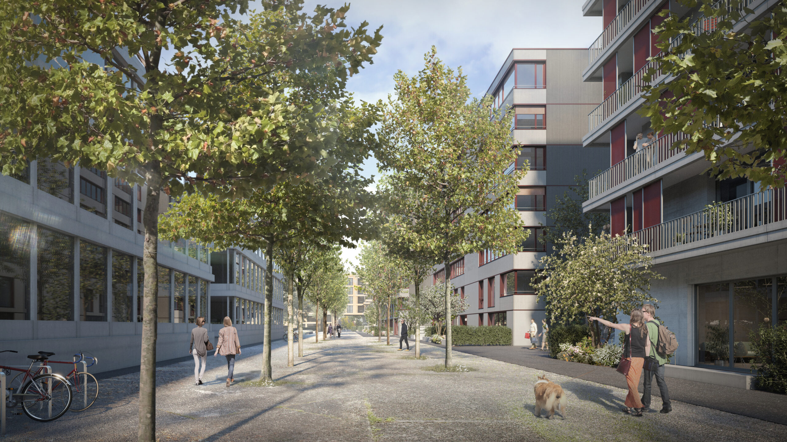
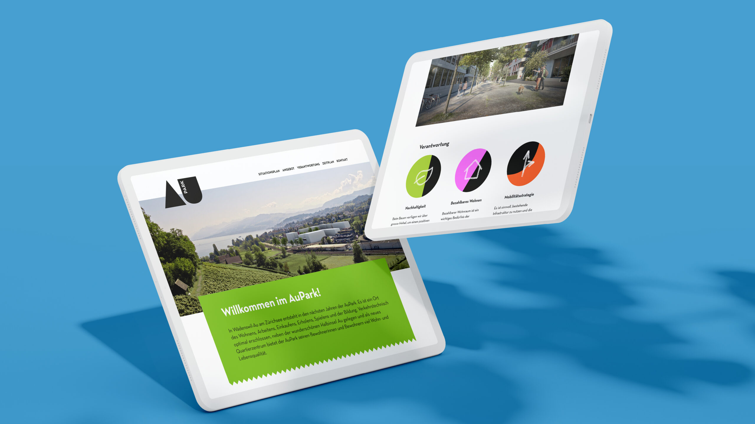
Right on the shores of Lake Zurich, Au Park is set to become a unique and innovative development.
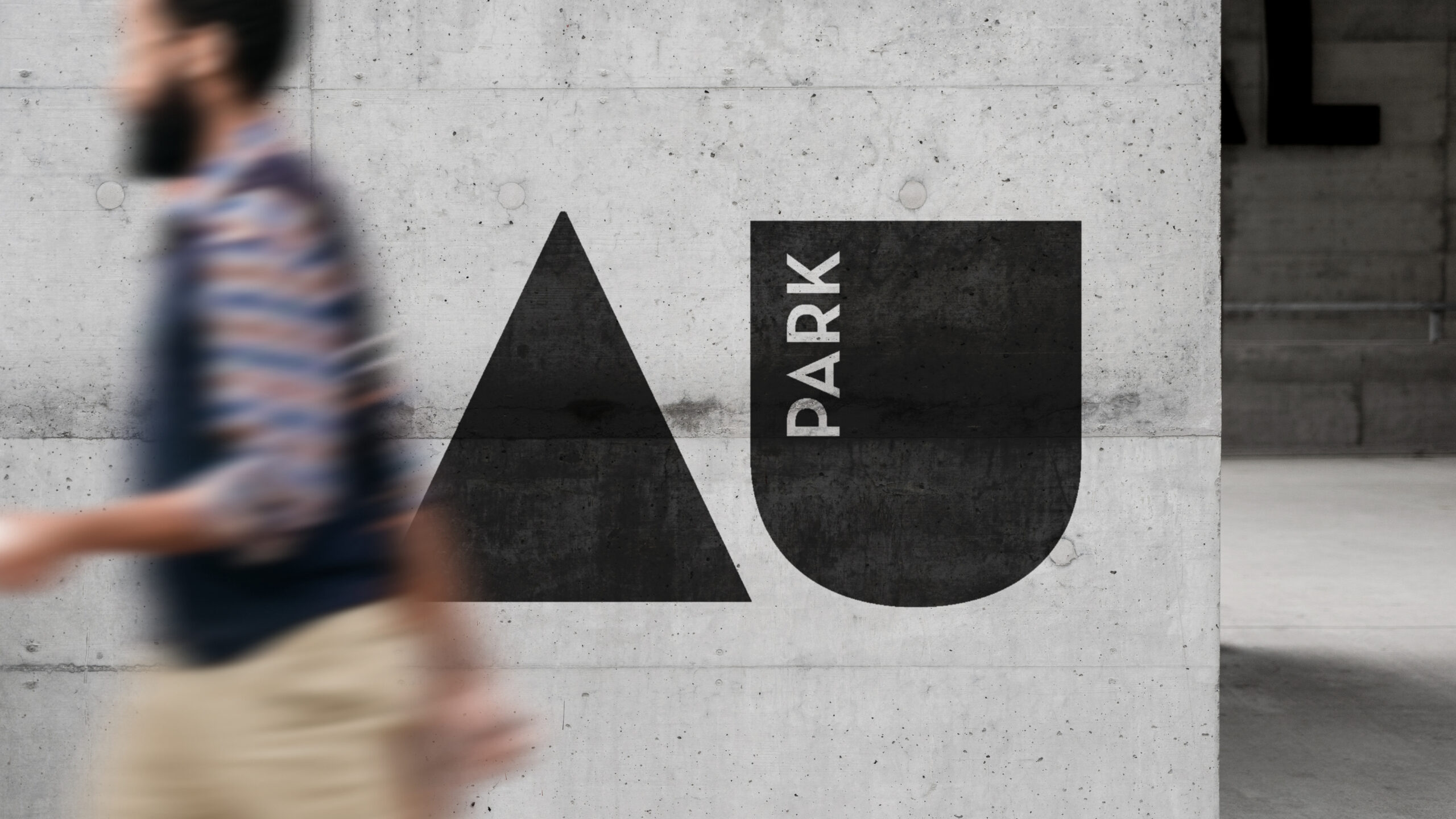
In a region known for its exclusivity and high property prices, Au Park stands out by offering a more accessible alternative — aimed at a younger, more diverse audience. The project blends a variety of architectural styles and housing concepts, reflected in a brand identity that embraces diversity and forward-thinking design.
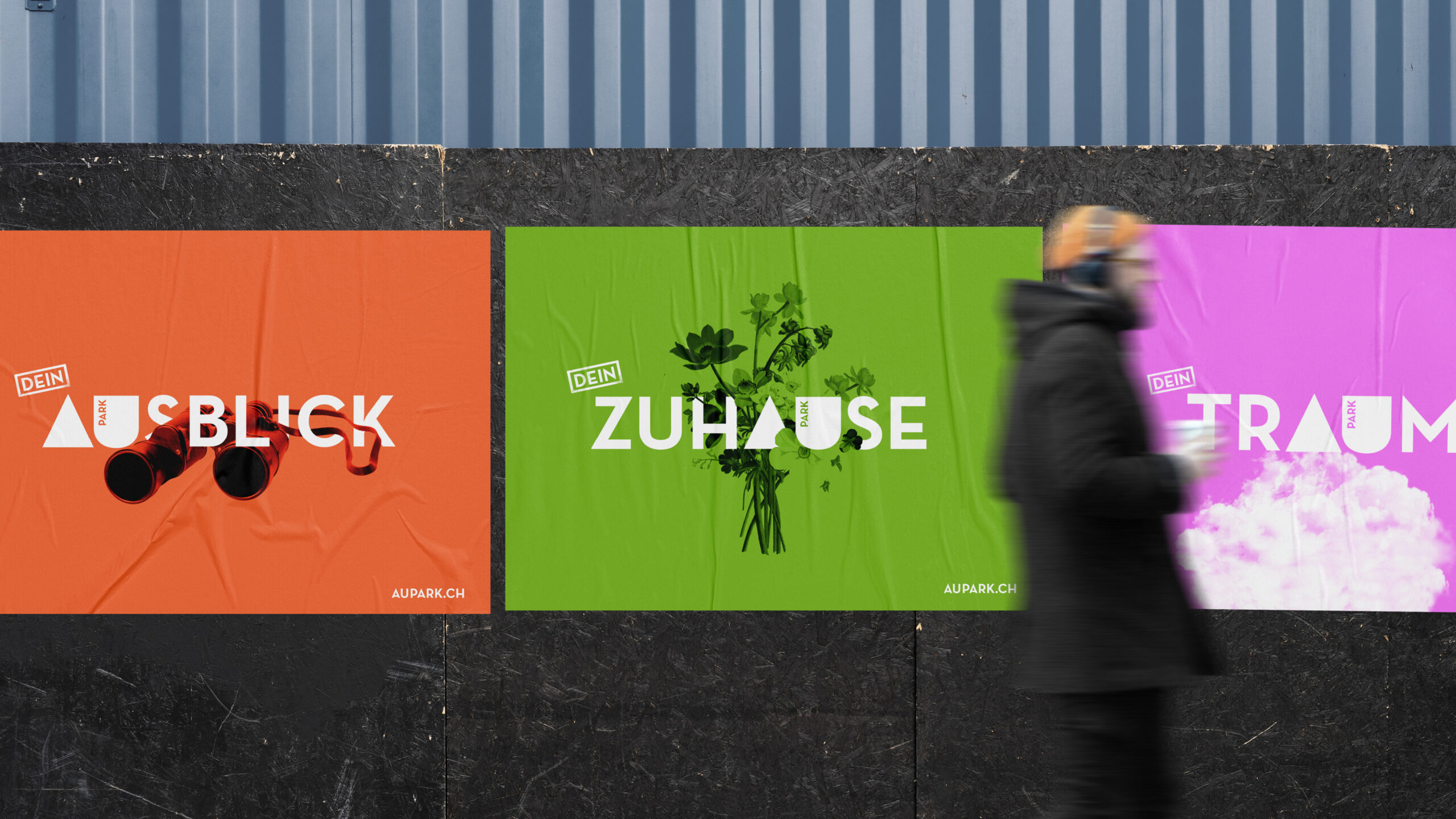
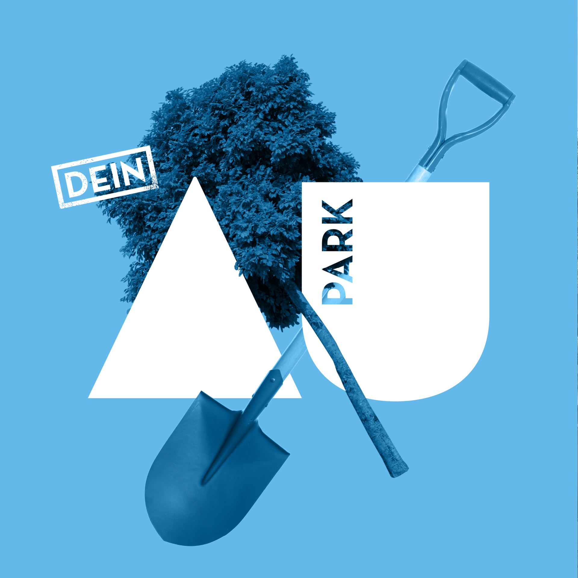
The challenge was to create a coherent brand that appeals to a broad target group: tenants, buyers, investors, and public authorities. We developed a distinct visual toolkit to communicate Au Park over several years as a vibrant, innovative, and natural place in a prime location.
Approach
Transforming brands and businesses with simple, remarkable ideas.
Contact
